You can have the best product, the best material and the best location, and still sell little if the display is badly designed. On the cosmetics shelf, the customer decides in about three seconds whether to step closer or walk past. Design is what wins or loses those three seconds.
Designing a display that sells — not just one that looks pretty — is a craft with rules. At Atamark we have been manufacturing cosmetics POS displays for 14 years in Parets del Vallès and we have seen both sides: gorgeous displays that moved no product and plain ones that sent rotation soaring. The difference is almost never the budget; it’s the judgement. These are the seven principles we apply.
1. The display competes for a three-second glance
In a perfumery or a big-box shelf, your display doesn’t only compete with the brand next to it: it competes with the customer’s phone, with their hurry and with dozens of stimuli. The first battle is to stop the glance. If in three seconds it doesn’t communicate «what it is, who it’s for and why now», the rest of the design doesn’t matter.
📖 Not sure which format suits you? Start with Types of POS displays for cosmetics →
2. The seven design principles that increase conversion
1. Visual hierarchy: direct the gaze
The eye needs an order: first the hero (the star product or the message), then the support, then the detail. A display where everything shouts equally communicates nothing. Define a single protagonist per face and build everything around it.
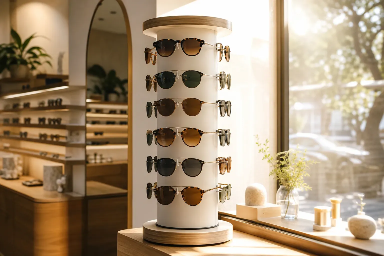
2. The hot zone: eye and hand height
The product you want to sell goes at eye level (1.40-1.60 m) and within hand’s reach. The top is for brand image; the bottom, for stock and large formats. Placing the key product outside the hot zone is the most common and most expensive mistake.
3. One header, one message
The header (the top section) is your headline. A single message, large and legible from three metres. «New anti-ageing routine», not a paragraph. If the customer has to stop and read, you’ve already lost them.
4. Zero friction to pick up the product
In cosmetics, touching is buying. If the product is hard to reach, wedged in, or risks knocking over the one beside it, the customer won’t pick it up. Design so that picking up and putting back is easy: generous gaps, comfortable heights, no walls of product.
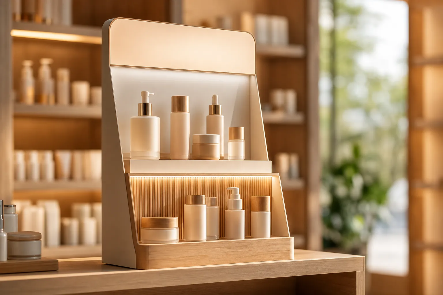
5. Lighting: what’s lit, sells
A well-placed LED strip completely changes the perception of a display: it gives a premium feel, separates it from the neighbouring shelf and directs attention to the hero product. It’s one of the best return-per-euro investments in cosmetics.
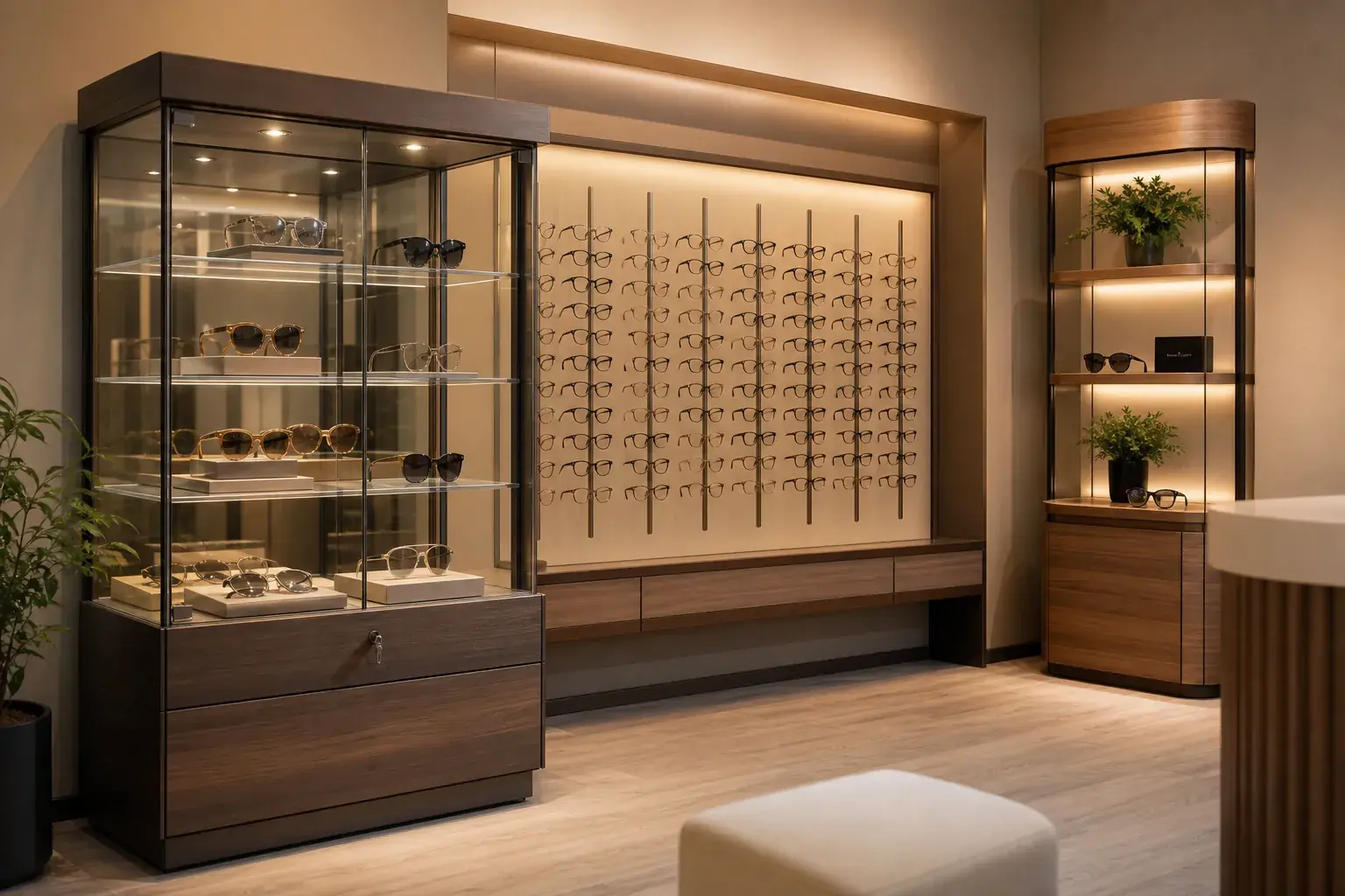
6. Colour and contrast to stand out from the shelf
Your display lives surrounded by others. If it shares the environment’s palette, it disappears. A contrast of colour or material (a warm background among white shelves, a metallic accent) makes the eye find it sooner. Consistent with the brand, but different from the neighbour.
7. Design for replenishment
A gorgeous but empty display doesn’t sell and, worse, signals that the product «isn’t working». If replenishment is complicated, store staff won’t keep it up. Design easy refill access and plan the facing (how many units across the front) so it withstands the sales pace between visits.
3. Three mistakes that kill conversion
- Cramming in too many messages. A display is not a brochure. One headline, one protagonist, one action.
- Designing for the catalogue, not the store. What shines in the render may be unreachable or fragile on the real shelf. Think use, not photo.
- Ignoring whoever replenishes. If restocking is costly, the display will spend half the campaign half-full.
4. How to know if your display works
Designing well is half the job; measuring is the other. Even simply, compare rotation with the display vs without it, ask the retailer for sell-out data from stores carrying your POS, and do an observation round: do people stop? do they pick up the product? do they put it back in place? Those three gestures tell you more than any render.
📖 And if you repeat campaign after campaign, design with reuse in mind: Reusable and modular POS displays: how to cut waste →
Frequently asked questions
What increases a cosmetics display’s conversion the most?
The combination of clear visual hierarchy (a single protagonist), product at eye level and zero friction to pick it up. Add lighting and the jump is notable. No single element works magic; it’s the sum, well executed.
Is LED lighting in the display worth it?
In cosmetics, almost always yes. Light gives a premium perception, separates your display from the neighbouring shelf and directs the gaze to the hero product. It’s one of the best return-per-euro investments, especially in perfumery and skincare.
How much product should I put on the display?
Enough so it looks full and lasts between replenishments, but without saturating it. A wall of product reduces the sense of exclusivity and makes it harder to pick up a unit. Prioritise a clean facing of the hero product over piling up references.
We design your display to sell
At Atamark we don’t just manufacture: we design the display with real-shelf conversion in mind — hierarchy, lighting and replenishment ergonomics. Tell us the product and the point of sale and we’ll propose a design built to sell, not just to look good.
→ Request a quote · See POS solutions for cosmetics · Types of displays for cosmetics